
Say what you offer
A benefit headline and one clear action above the fold.
Ten practical UX principles for turning more visitors into enquiries and customers, with a simple audit you can run yourself.
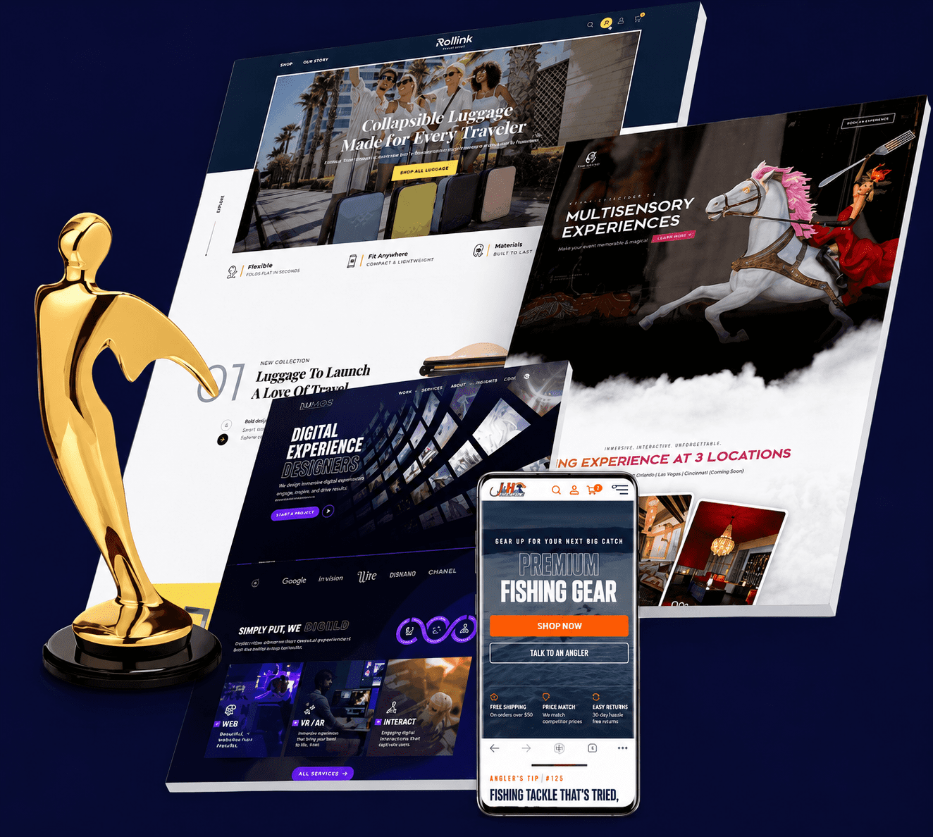

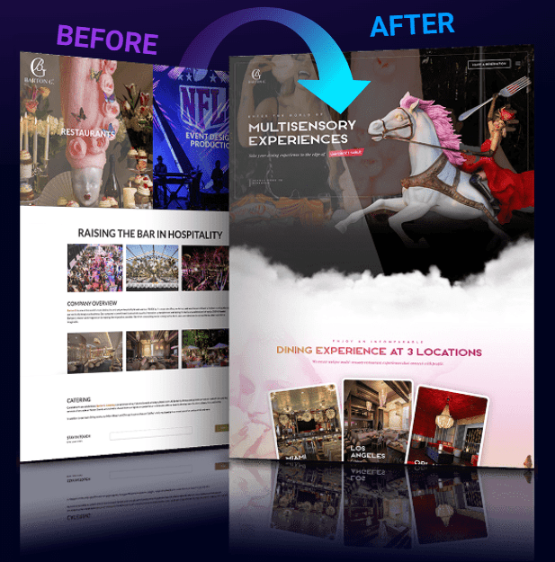
User experience is the sum of everything a visitor meets on your site: what the page says, how quickly it loads, how easy the next step is to find and how much they trust you. A visitor rarely leaves because of one big flaw. They leave because a dozen small frictions added up. Good UX design removes those frictions so the path from landing to enquiry or purchase feels obvious.
The principles below are not tricks. Most come from long-established usability research, and each one can be checked on your own site in an afternoon.
A first-time visitor should be able to answer three questions almost instantly: what is this, is it for me, and what do I do next. Put a clear benefit headline, one supporting sentence and one primary call to action above the fold. If the headline could sit on a competitor's site unchanged, it is too vague.
People scan before they read. Size, colour, contrast and spacing tell them what matters most. Use one dominant heading per page, keep body text readable and give the primary button more visual weight than everything around it. When everything shouts, nothing is heard.
A main menu of five or six labels in plain language beats a clever mega-menu. Use the words visitors use, keep the menu in the same place on every page and make the logo link home. Nielsen Norman Group's usability heuristics on consistency and recognition over recall are a good checklist here.
Most sites now receive a large share of their visits on phones, so design the small screen first and scale up. That means thumb-friendly buttons, readable text without zooming, short forms and no content that only works with a mouse.
Every field you ask for is a chance for someone to give up. Ask only for what you need to take the next step, use clear labels, show errors next to the field that caused them and offer guest checkout in stores. Baymard Institute's checkout research repeatedly finds that long or complicated checkouts and forced account creation cost sales.
Trust signals work best at the moment of doubt, not in a separate page nobody reads. Put real reviews near the buy button, security and payment badges at checkout, clear contact details in the footer and honest information about pricing, delivery and returns. Use only proof you can stand behind.
Use action-oriented text that says what happens next, such as Get my free audit rather than Submit. Keep one primary action per page, give it contrast and repeat it after long sections so no one has to scroll back up.
Speed is part of UX. Slow pages frustrate visitors and Google measures loading, interactivity and visual stability through Core Web Vitals. Compress images, load only the scripts you need and test on a mid-range phone rather than your fastest laptop.
Accessible design helps everyone: sufficient colour contrast, keyboard navigation, descriptive alt text and clear focus states. It also reduces legal risk and widens your audience.
Tell us about your business and we will suggest a simple, honest plan. Free consultation, no obligation.
Get a free consultationOpinions about design are cheap. Use analytics to find where visitors drop off, session recordings and heatmaps to see why, and A/B tests to confirm that a change actually helps. Improve one thing at a time so you know what worked.
Pick one principle, such as trimming your main form to the essential fields, make the change and measure enquiries for a few weeks before moving to the next.
Most visitors do not read a page word by word. They scan headings, bold phrases, bullet points and buttons, looking for the answer to their question. Help them by putting the most important information first, breaking text into short paragraphs and using descriptive headings that could stand on their own. A heading such as "How our free audit works" tells a scanner far more than "Our process". Avoid walls of text, long sentences full of jargon and vague promises. If a paragraph does not help someone decide or act, cut it.
Images should carry information, not just decorate. Show the product in use, the team behind the service, a real result or a diagram that explains something simply. Generic stock photos of smiling people at laptops tell visitors nothing and can reduce trust. Compress images and set width and height so that the page does not jump while loading, and add alt text that describes what is shown. Video can be powerful for explaining a service, but avoid autoplaying with sound and make sure the page is still usable if the video does not load.
Good UX is judged as much by what happens when things go wrong as when they go right. A search with no results should suggest alternatives, not show a blank page. A failed payment should say what happened and how to fix it. A form error should point to the exact field and explain how to correct it in plain words. A 404 page should offer a search box and links to key pages. These small moments are where frustrated visitors decide whether to stay or leave, and they are often forgotten in design reviews.
Your visitors differ in age, ability, device, connection speed and technical confidence. Someone may be using a cracked phone screen in bright sunlight, a screen reader, a slow rural connection or a tablet held with one hand. Test with real people from your audience, not only colleagues who already know the site. Watch quietly as they attempt a task, note where they hesitate and resist the urge to explain. Five short sessions often reveal the majority of major usability problems.
A beautiful layout cannot rescue confusing content. Before designing a page, decide what question it answers, what the visitor needs to know to decide and what action follows. Write the headings and key text first, then design around them. Use the words your customers use, answer objections honestly, and keep pricing and delivery details easy to find. When pages are long, add a short summary or contents list so people can jump to what they need.
An audit will usually produce more issues than you can fix at once. Rank them by how many visitors they affect, how much they harm the main goal and how easy they are to fix. A slow homepage, an unclear headline and a broken form on your busiest page come first. Cosmetic issues on a rarely visited page can wait. Record each change and the date, so that you can compare enquiries before and after and learn which improvements make the biggest difference.
Many of these principles can be applied in-house, but a UX specialist can be worth the cost when conversions are low despite good traffic, when you are redesigning a site, launching an online shop or building a complex tool, or when you lack the time to research properly. Look for someone who starts with research and your goals rather than opinions, shows their process and past work, explains findings in plain language and proposes changes that can be tested. Be wary of anyone who promises a specific conversion increase before looking at your site.
Two simple exercises reveal a lot. In a five-second test, show a page to someone unfamiliar with your business for five seconds, then hide it and ask what the page offered and who it was for. If they cannot say, your headline and hierarchy need work. In a task test, ask someone to complete a real goal, such as booking a call or finding your prices, while thinking aloud. Watch where they hesitate and note their words. Repeat with several people and look for patterns, not one-off comments. These tests cost nothing and often lead to the most valuable fixes on the whole site.
Note each change you make, why you made it and what you expect to happen. After a few weeks, record what actually did. Over time the log turns individual fixes into knowledge about what your audience values, prevents repeating failed ideas and makes it easier to hand work to a new designer or team member.
Rainmaker Art can plan, build and manage it with you. Send a few details and we will reply with clear next steps.
Get a free consultationA benefit headline and one clear action above the fold.
Shorter forms, guest checkout and plain-language labels.
Thumb-friendly, fast and readable without zooming.
Reviews, guarantees and clear contact details near decisions.
Analytics, recordings and A/B tests, one change at a time.
UX design increases sales by eliminating cognitive and physical friction: applying Hick's Law to limit each screen to one primary decision, using F-pattern visual hierarchy and high-contrast buttons so the eye lands immediately on the CTA, sizing mobile tap targets to 48px inside the thumb zone, and cutting navigation paths from 10 clicks down to 2.
Free UI/UX Conversion Review of Your Current Website. Learn more about our custom Figma UI/UX and conversion web design services.
Clarity. If visitors cannot tell what you offer and what to do next within a few seconds, no other improvement matters much.
Look for pages with high exits, forms that people start but do not finish and a large gap between mobile and desktop conversion. Recordings and heatmaps show why.
Not always. Many gains come from fixing specific pages, forms and calls to action. A redesign makes sense when the structure itself no longer fits your goals.
Rainmaker Art is a web design agency in Billings, MT that builds fast, mobile-first WordPress and Elementor websites with local SEO, a free audit and no lock-in contracts.
Send us your website and we will point out the friction that is costing you enquiries, then recommend what to fix first. No pressure, no jargon.