One audience, one goal
Build the page around a single action.
Ten practical rules for a landing page built around a single goal, from message match to mobile speed.
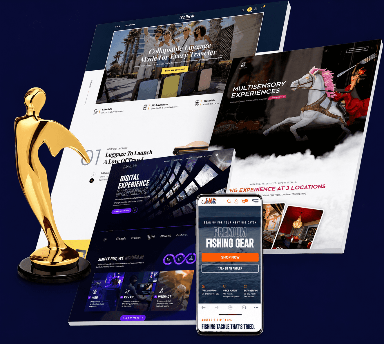
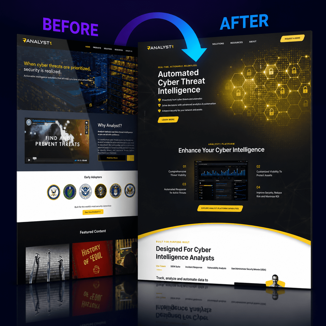
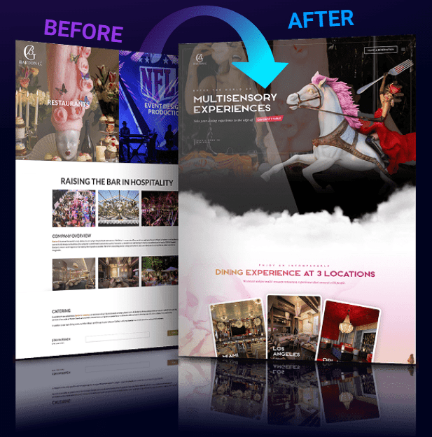
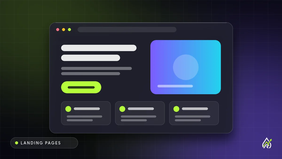
A landing page is a page built for one audience and one action. Unlike a homepage, which has to serve many visitors and goals, a landing page removes everything that competes with its single aim: a booked call, a form submission, a download or a purchase. That focus is why it usually converts better than sending the same traffic to a general page.
Visitors arrive with a promise in mind, from an ad, an email or a search result. The headline should repeat that promise in the same words. If the ad says free PPC audit, the page should say free PPC audit, not a generic agency welcome. This message match also helps Google Ads landing page experience.
Above the fold, give a benefit-led headline, one supporting sentence, one primary button and a visual that shows the offer. Resist the urge to add a second or third call to action. Repeating the same action further down is fine.
List what the visitor gets and why it matters to them. Keep sections short, use scannable headings and write in plain language. A feature says what it is; a benefit says what changes for the customer.
Testimonials, client logos, ratings, case studies and guarantees reduce doubt. Use real ones, with names and context where possible. If you have no proof yet, be specific about your process and what the visitor will receive, rather than inventing numbers.
Ask only for what you need to follow up. Name and email is often enough for a first step. Add a line under the button that says what happens next and how you will use their details.
Most landing pages work better without the full site navigation, sidebar links and footer menus, because each link is a way to leave. Keep a logo, contact details and essential legal links.
Check the page on a phone before anything else. Buttons should be easy to tap, text readable without zooming and the form usable with one hand. On mobile, consider a sticky call button.
Slow landing pages waste ad spend. Compress images, avoid heavy sliders and third-party scripts and check Core Web Vitals. A fast page is also easier to keep stable when traffic spikes.
Headline and offer, one clear button, three benefits, proof, a short how-it-works, a repeat of the button, then FAQs that answer the last objections.
Set up conversion tracking for form submissions, calls and button clicks before you spend on traffic. Without it you cannot tell whether the page works or which source sends the best leads.
Once the page has enough traffic, test the headline, offer and form. Change one thing at a time and keep a record of what you learn. Read our guide to A/B testing for how to do it properly.
Tell us about your business and we will suggest a simple, honest plan. Free consultation, no obligation.
Get a free consultationNot every landing page does the same job. A lead-generation page trades something useful, such as a guide, quote or consultation, for contact details. A click-through page warms a visitor up and sends them onward to a checkout or booking page. A sales page makes the whole case and asks for payment. A event or webinar page focuses on registration. Decide which job yours has before writing a word, because each calls for different length, tone and proof. Higher-priced or more complex offers usually need more explanation, while simple, low-risk offers work with less.
The headline carries more weight than any other element. It should say what the visitor gets, for whom and, if possible, how quickly or easily. Compare "Welcome to our services" with "A free website audit for local businesses, delivered in two working days". The second matches intent, sets an expectation and invites action. Follow it with a short subheading that adds one important detail, and check that both still make sense on a small phone screen.
Everyone who lands on your page has doubts: is this legitimate, will it work for me, what will it cost, what happens after I submit? List the most common objections, gathered from sales conversations, emails and reviews, and answer each honestly on the page. A short FAQ, a plain description of your process and clear terms often lift conversion because they remove uncertainty. Where a limitation exists, say so; it builds credibility and filters out poor-fit leads.
Deadlines and limited availability can encourage action, but only when real. A booking calendar with genuinely limited slots, a seasonal price or an event date is legitimate. Fake countdown timers that reset, invented stock levels or pressure language erode trust and can breach advertising rules. If you have no genuine deadline, focus on clarity and value, and let the offer speak for itself.
Traffic source changes what the page should do. Search visitors often have a specific need and want direct answers, so match the keyword and get to the point. Social visitors are more casual and easily distracted, so lead with a strong visual and a simple promise. Email subscribers already know you, so the page can be shorter and more personal. Building separate pages for major sources keeps the message tight and makes it easier to see which channel performs best.
What happens after the form is submitted is part of the experience. Show a confirmation page that repeats what will happen next and when, send an immediate email confirming receipt and follow up within the time you promised. Offer a next step while interest is high, such as a calendar link or a helpful resource. Leads who hear back within minutes are far more likely to engage than those who wait days.
A local service business might create a page for "Free roof inspection in [your area]" with a headline that names the offer, three benefits, photos of recent jobs, review snippets, a short form asking for name, phone and address and a line about the response time. An online course creator might build a page with a short video introduction, a clear outline of what students will learn, testimonials from past students, a fair price and a money-back guarantee if one exists. A consultant might offer a fifteen-minute discovery call with a page explaining who it suits, what will be discussed and how to book. In each case, the page addresses one audience, one promise and one action.
If you are stuck writing, answer these questions in plain language. Who is this for? What problem do they have right now? What do they get from this offer? Why should they trust you? What will happen after they click? What is the lowest-risk first step? What questions do they have before saying yes? Turn each answer into a section or a sentence, edit ruthlessly and read the result aloud. Copy that sounds like a person talking usually beats copy that sounds like a brochure.
Even paid landing pages benefit from good foundations. Use a clear title and one main heading, add descriptive alt text, keep sufficient colour contrast and make sure that buttons and forms can be used with a keyboard. Avoid blocking the page from being read by search engines unless it is intentionally temporary. For ads, follow the landing page quality guidance of your platform, which typically rewards relevant, transparent, easy-to-navigate pages that load quickly.
Explain how you will use people's details and link to your privacy policy near the form. Where the law requires consent for marketing messages, use clear, unticked checkboxes and record consent. Keep testimonials genuine and ask permission before using names or photos. Do not claim awards, numbers or guarantees you cannot substantiate. Advertising standards and consumer protection rules apply to landing pages as they do to any other advertising.
The first version of a landing page is a hypothesis. Watch conversion rate by source, read form entries and listen to what leads ask on the phone. If many people ask the same question, add the answer to the page. If visitors from one source convert poorly, check message match. Give changes enough time to gather data, and keep an archive of old versions so you can compare or roll back. A landing page that improves steadily over months usually becomes one of the best-performing assets a small business owns.
Rainmaker Art can plan, build and manage it with you. Send a few details and we will reply with clear next steps.
Get a free consultationBuild the page around a single action.
Headline echoes the ad or email that brought them.
Real testimonials, logos and guarantees.
Only what you need to follow up.
Conversion tracking first, then A/B tests.
As long as it needs to answer the visitor's questions and no longer. Simple offers can work with a short page; higher-priced or unfamiliar services usually need more explanation and proof.
Usually not. Removing the main menu keeps visitors focused on the single action. Keep contact details and essential legal links.
One for each distinct audience and offer. Sending different ad groups to matching pages is a common way to lift relevance and results.
Tell us about your offer and traffic source and we will recommend a page structure and a fixed-scope quote. No pressure, no jargon.