
Write a hypothesis
State the problem, the change and the metric you expect to move.
How to run tests you can trust: form a hypothesis, test one thing, size the sample properly and learn from every result.


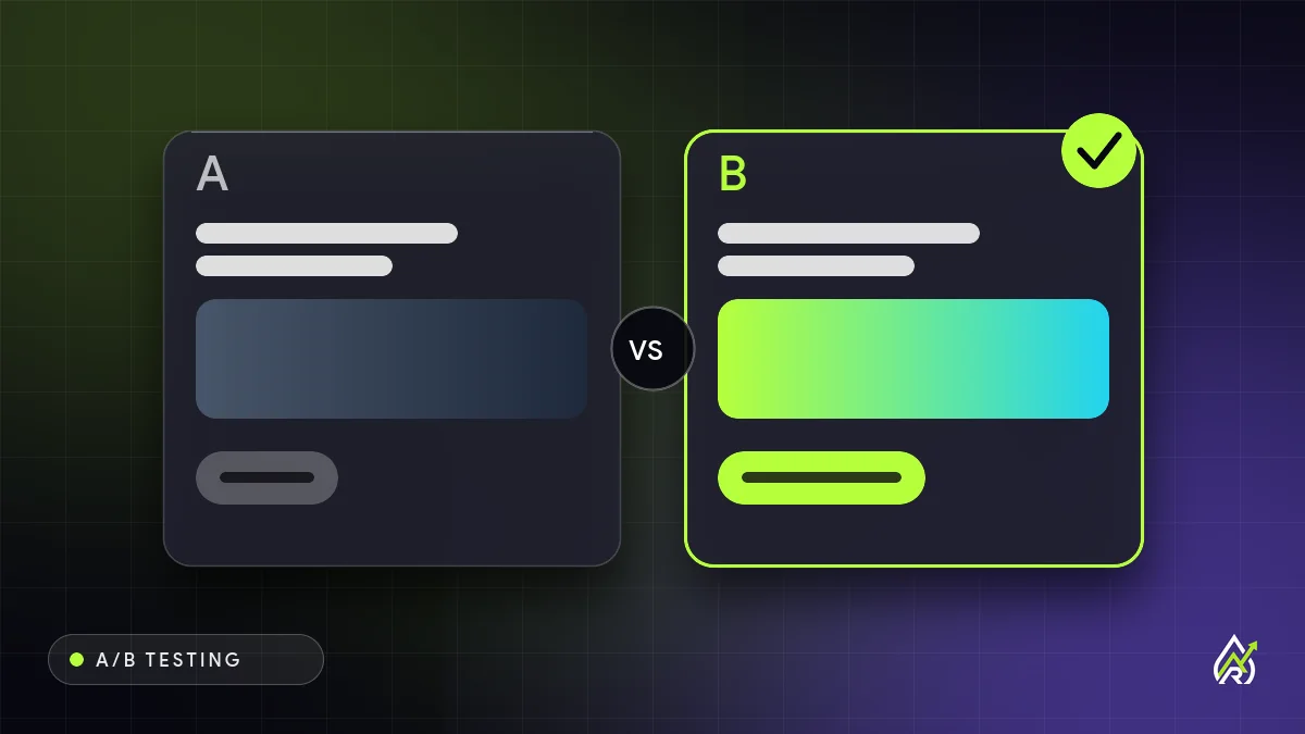
An A/B test shows two versions of a page or element to similar visitors at the same time and measures which one produces more of the outcome you care about, such as form submissions or purchases. It is the most reliable way to learn whether a change helps, because it replaces opinion with evidence.
It is not a way to validate a decision you have already made, and it is not useful on a page that gets very little traffic. Getting the setup right matters more than the tool you use.
A good test starts from a problem you can see in the data and states what you expect to change and why. For example: because most visitors leave the pricing page without clicking, making the primary button clearer and moving it above the plans will increase demo requests. That gives you a reason, a change and a metric.
If you change the headline, image and button together you will not know which one mattered. Test a single variable, or a single coherent idea, so the result teaches you something you can reuse elsewhere.
Small differences need a lot of visitors to detect. Before you launch, use a sample-size calculator to estimate how many visitors each version needs, based on your current conversion rate and the smallest improvement worth caring about. Then commit to that number.
Checking results daily and ending the test when they look good is one of the most common ways to fool yourself. Decide the stopping rule before you start.
Statistical significance tells you how unlikely your result would be if the two versions were actually the same. Most teams look for a high level of confidence before acting, but a significant result on a tiny effect may not be worth the change. Consider the size of the lift and the cost of implementing it, not only the p-value.
For every test record the hypothesis, screenshots, dates, sample size, result and what you decided. Over time this becomes a map of what your audience responds to, which is more valuable than any single win.
If a page has a clear usability problem, such as a broken form or a confusing checkout, fix it. Testing is for choosing between good options, not for confirming that broken things are broken.
Tell us about your business and we will suggest a simple, honest plan. Free consultation, no obligation.
Get a free consultationEvery test needs one main measure of success, chosen before it starts. If you sell online, it might be completed purchases or revenue per visitor. For a service business, it might be submitted enquiry forms, booked calls or clicks on a phone number. Avoid choosing a shallow metric such as clicks on a button if the real goal happens later. A headline that gets more clicks but attracts less qualified enquiries can look like a win while quietly hurting the business.
Add a few guardrail metrics that you will watch to make sure the winner does not cause harm elsewhere, such as bounce rate, page speed, refund rate or lead quality. If a variation improves sign-ups but lowers the share of people who become customers, you want to know before rolling it out.
A small agency notices that its contact page gets plenty of visits but few form submissions. Session recordings show visitors scrolling through a long form and leaving at the phone number field. The hypothesis: because many visitors hesitate to share a phone number, making it optional and explaining how the details are used will increase completed forms. Version A keeps the form as it is. Version B makes the phone field optional and adds a one-line reassurance under the button.
The team calculates how many visitors each version needs, runs the test for three full weeks and finds that version B increases submissions by a meaningful margin without lowering lead quality. They roll it out, log the result and plan the next test on the headline above the form. Nothing here required advanced tools. It required a clear problem, one change and patience.
Many platforms offer testing features, from website builders and email tools to dedicated experimentation software. Choose one that fits your traffic and technical comfort, and check that it does not slow your pages or cause flicker, where visitors briefly see the original version before the variation loads. Confirm that conversions are tracked correctly for both versions before you begin, and run a quick test to make sure each variation displays properly on phones and desktops. Google Optimize has been discontinued, so check that any tool you use is currently supported and privacy-compliant.
The same thinking applies to emails and ads. You can test subject lines, send times, offers and calls to action in email, or headlines, images and audiences in paid campaigns. The rules are the same: one clear change, enough volume, a fixed duration and a metric tied to the real goal. Learnings often transfer between channels, so a headline that wins in an ad may deserve a trial on the landing page.
When a test finishes, do not simply declare a winner and move on. Ask why it might have won. Check whether the effect was the same on mobile and desktop and across traffic sources. Consider whether the result surprised you, and what that says about your assumptions. If the test was inconclusive, that is still information: the change probably does not matter much, and you can spend your effort elsewhere. Then plan the next test. Small, steady gains compound over months and give you a clearer picture of your customers than any single big redesign.
Testing involves showing different experiences to real people, so keep it honest. Do not use fake scarcity, misleading countdowns or hidden costs, even if they win a test. Respect cookie and privacy rules where you operate, explain data use in your privacy notice and avoid collecting more information than you need. A tactic that increases short-term conversions but damages trust costs more in the long run than it earns.
An overall winner can hide differences between groups. New visitors may respond differently from returning ones, mobile users differently from desktop users and paid traffic differently from organic. Once a test has reached its planned sample size, look at the main segments to see whether the result is consistent. If a variation wins on desktop but loses on mobile, you may want to use it only where it helps. Be careful not to slice the data so finely that random noise looks like a finding; treat segment insights as ideas for a follow-up test, not proof.
A standard A/B test compares two versions. A split URL test sends visitors to entirely different pages, which suits major redesigns. A multivariate test changes several elements at once to see how they combine, but it needs far more traffic and is rarely appropriate for small sites. For most small businesses, simple A/B tests on the highest-traffic pages are the best place to start.
The greatest benefit of testing is not any single win. It is a habit of asking, "How do we know?" Encourage everyone on the team to suggest ideas and record the reason behind them. Celebrate tests that disprove a favourite idea, since they save you from a costly mistake. Share results in plain language, with screenshots, so that decisions are transparent and lessons are easy to reuse. Over months, this culture shifts a business from arguing about opinions to learning from customers.
Rainmaker Art can plan, build and manage it with you. Send a few details and we will reply with clear next steps.
Get a free consultationState the problem, the change and the metric you expect to move.
So you know what caused the result.
Estimate visitors needed before you launch.
Whole weeks, no early stopping.
Record every result and reuse what it teaches.
It depends on your current conversion rate and the size of lift you want to detect. Lower traffic pages need bigger changes and longer tests. If you have very little traffic, focus on fixing clear problems instead.
Long enough to reach the sample size you planned and to cover at least one or two full weekly cycles. Ending early because one version looks better is a common mistake.
Start where the most visitors and the biggest drop-off meet: usually the headline, primary call to action and main form on your highest-traffic landing pages.
Tell us about your site and traffic and we will recommend where testing will pay off and what to fix first. No pressure, no jargon.